FLAGSHIP · BUSINESS DECISION ANALYTICS
Why revenue fell while units rose
A reproducible retail diagnostic showing how data quality, KPI design, price-volume decomposition, segmentation, anomaly triage, and decision framing turn an apparently contradictory sales story into a defensible business diagnosis.
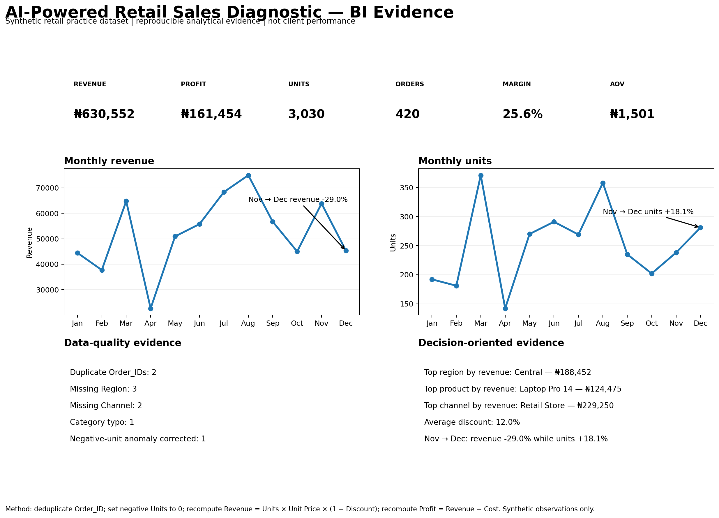
More units did not translate into more economic value.
Revenue declined despite higher unit volume. In the synthetic data, H2 combined more low-value units with lower realized prices: units were 48.3% higher than H1 while revenue was 14.8% lower. ASP fell 33.1%, average discount rose 159.5%, profit fell 23.4%, and average margin declined 3.5 percentage points (7.5% relative).
Units increased materially in H2.
ASP fell sharply while discounts increased.
Mix and discounting coincided with weaker financial outcomes.
Decision takeaway
Volume alone is an incomplete success metric. Pair units with realized price, product mix, discount, contribution margin, and channel economics.
- Set margin floors for paid-acquisition promotions.
- Shift blanket discounts toward bundles and trade-up paths.
- Protect high-value product availability and merchandising.
- Monitor units, ASP, discount, contribution margin, product mix, and channel mix together.
- Run controlled discount/channel tests before scaling spend.
What this case proves
- Business-question framing before tool selection.
- Data-quality controls before interpretation.
- Quantitative decomposition rather than surface-level KPI reporting.
- Segmentation and anomaly triage tied to the decision question.
- Explicit limits on causal and client-impact claims.
Key evidence
| KPI | H1 | H2 | Change |
|---|---|---|---|
| Revenue | $5.86m | $4.99m | −14.8% |
| Units | 96,230 | 142,680 | +48.3% |
| ASP | $91.02 | $60.86 | −33.1% |
| Profit | $2.77m | $2.12m | −23.4% |
| Average margin | 46.7% | 43.2% | −3.5 pp (−7.5% relative) |
| Average discount | 10.1% | 26.2% | +159.5% |
Investigation design
- Profile and repair an intentionally imperfect raw dataset.
- Build a KPI layer and compare H1 vs H2.
- Decompose product revenue change into volume, price, and interaction effects.
- Compare product, category, region, segment, and acquisition-channel performance.
- Flag anomalies and separate observed facts from interpretation.
- Translate evidence into recommendations and a monitoring dashboard narrative.
Data grain
4,611 rows across 12 months, 8 products, 4 categories, 4 regions, 3 customer segments, and 4 channels.
Where the pressure concentrated
- Premium Audio revenue: −35.7%.
- Pro Camera revenue: −34.7%.
- Electronics revenue: −35.0%.
- Essentials revenue: +21.2%.
- Paid Social revenue: −16.6%; margin change: −7.8%.
- West had the largest regional revenue decline at −16.4%.
Data quality and causal limits
The raw file contains intentionally introduced defects such as duplicates, missing keys, inconsistent labels, invalid dates, impossible discounts, zero units, negative revenue, cost anomalies, an outlier, and a broken profit identity. The pipeline documents each treatment.
Because the data is synthetic and observational, the project does not establish causality. Controlled experiments, inventory context, media spend, conversion data, and stable segment definitions would be required for causal attribution.